Predicting IBM Churn with LDA and XGBoost

HR Churn Analysis
This is me fiddling around with an employee attrition dataset on my last few days at PNC.
Description
Uncover the factors that lead to employee attrition and explore important questions such as ‘show me a breakdown of distance from home by job role and attrition’ or ‘compare average monthly income by education and attrition’. This is a fictional data set created by IBM data scientists.
Education 1 ‘Below College’ 2 ‘College’ 3 ‘Bachelor’ 4 ‘Master’ 5 ‘Doctor’
EnvironmentSatisfaction 1 ‘Low’ 2 ‘Medium’ 3 ‘High’ 4 ‘Very High’
JobInvolvement 1 ‘Low’ 2 ‘Medium’ 3 ‘High’ 4 ‘Very High’
JobSatisfaction 1 ‘Low’ 2 ‘Medium’ 3 ‘High’ 4 ‘Very High’
PerformanceRating 1 ‘Low’ 2 ‘Good’ 3 ‘Excellent’ 4 ‘Outstanding’
RelationshipSatisfaction 1 ‘Low’ 2 ‘Medium’ 3 ‘High’ 4 ‘Very High’
WorkLifeBalance 1 ‘Bad’ 2 ‘Good’ 3 ‘Better’ 4 ‘Best’
Libraries
import pandas as pd
import numpy as np
import matplotlib.pyplot as plt
import plotly.express as px
import seaborn as sns
import sklearn

from IPython.core.interactiveshell import InteractiveShell
InteractiveShell.ast_node_interactivity = 'all'
%load_ext autoreload
Read in Data
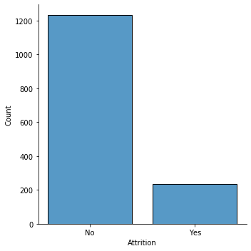
df = pd.read_csv('ibm_attrition_file.csv').sort_values('Attrition')

df.head()
df.shape
df.dtypes

sns.displot(df, x='Attrition', shrink = .8)
| Age | Attrition | BusinessTravel | DailyRate | Department | DistanceFromHome | Education | EducationField | EmployeeCount | EmployeeNumber | ... | RelationshipSatisfaction | StandardHours | StockOptionLevel | TotalWorkingYears | TrainingTimesLastYear | WorkLifeBalance | YearsAtCompany | YearsInCurrentRole | YearsSinceLastPromotion | YearsWithCurrManager | |
|---|---|---|---|---|---|---|---|---|---|---|---|---|---|---|---|---|---|---|---|---|---|
| 734 | 22 | No | Travel_Rarely | 217 | Research & Development | 8 | 1 | Life Sciences | 1 | 1019 | ... | 1 | 80 | 1 | 4 | 3 | 2 | 4 | 3 | 1 | 1 |
| 949 | 39 | No | Travel_Rarely | 524 | Research & Development | 18 | 2 | Life Sciences | 1 | 1322 | ... | 1 | 80 | 0 | 9 | 6 | 3 | 8 | 7 | 1 | 7 |
| 948 | 30 | No | Travel_Rarely | 634 | Research & Development | 17 | 4 | Medical | 1 | 1321 | ... | 4 | 80 | 2 | 9 | 2 | 3 | 9 | 1 | 0 | 8 |
| 945 | 50 | No | Travel_Rarely | 1322 | Research & Development | 28 | 3 | Life Sciences | 1 | 1317 | ... | 2 | 80 | 0 | 25 | 2 | 3 | 3 | 2 | 1 | 2 |
| 944 | 28 | No | Non-Travel | 1476 | Research & Development | 1 | 3 | Life Sciences | 1 | 1315 | ... | 1 | 80 | 3 | 10 | 6 | 3 | 9 | 8 | 7 | 5 |
5 rows × 35 columns
(1470, 35)


Age                          int64
Attrition                   object
BusinessTravel              object
DailyRate                    int64
Department                  object
DistanceFromHome             int64
Education                    int64
EducationField              object
EmployeeCount                int64
EmployeeNumber               int64
EnvironmentSatisfaction      int64
Gender                      object
HourlyRate                   int64
JobInvolvement               int64
JobLevel                     int64
JobRole                     object
JobSatisfaction              int64
MaritalStatus               object
MonthlyIncome                int64
MonthlyRate                  int64
NumCompaniesWorked           int64
Over18                      object
OverTime                    object
PercentSalaryHike            int64
PerformanceRating            int64
RelationshipSatisfaction     int64
StandardHours                int64
StockOptionLevel             int64
TotalWorkingYears            int64
TrainingTimesLastYear        int64
WorkLifeBalance              int64
YearsAtCompany               int64
YearsInCurrentRole           int64
YearsSinceLastPromotion      int64
YearsWithCurrManager         int64
dtype: object


<seaborn.axisgrid.FacetGrid at 0x7ffca1cf6510>
EDA
I first look at some features that might be important in the dataset.
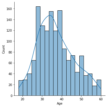
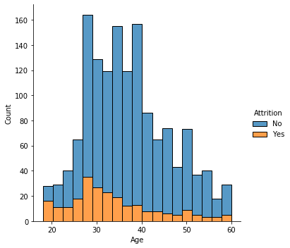
Attrition by Age
Attrition rates are higher among younger employees.
sns.displot(
    df.Age,
    kde = True
)
<seaborn.axisgrid.FacetGrid at 0x7ffc9e629ed0>
sns.displot(data=df, x="Age", hue="Attrition", multiple="stack")
<seaborn.axisgrid.FacetGrid at 0x7ffca2c9f410>
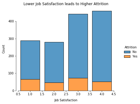
Job Satisfaction
Lower job satisfaction unsurprisingly yields a higher attrition rate although perhaps not as high as one might expect.
g = sns.displot(
    data = df,
    x = 'JobSatisfaction',
    hue = 'Attrition',
    multiple = 'stack',
    discrete=True,
    shrink = .8
    )

g.set_axis_labels("Job Satisfaction", "Count", labelpad=10)
g.set(title="Lower Job Satisfaction leads to Higher Attrition")
g.fig.set_size_inches(6.5, 4.5)
g.despine(trim=True)
<seaborn.axisgrid.FacetGrid at 0x7ffca3e423d0>


<seaborn.axisgrid.FacetGrid at 0x7ffca3e423d0>


<seaborn.axisgrid.FacetGrid at 0x7ffca3e423d0>
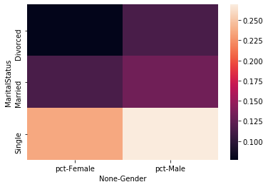
Gender and Marital Status
Single men and women are more likely to leave the company but age may be a confounder. Men are slightly more likely to leave than women.
df_new = df.copy()
df_new['Attr'] = df_new['Attrition'].apply(lambda x: 1 if x == 'Yes' else 0)
df_new['Count'] = 1
df_new_group = df_new.groupby(['Gender', 'MaritalStatus'])[['Attr', 'Count']].sum()
df_new_group['pct'] = df_new_group['Attr'] / df_new_group['Count']

df_heat = df_new_group.reset_index()[['Gender','MaritalStatus','pct']]\
    .pivot('MaritalStatus', 'Gender')

sns.heatmap(
    data=df_heat
)
<matplotlib.axes._subplots.AxesSubplot at 0x7ffca5c05c10>
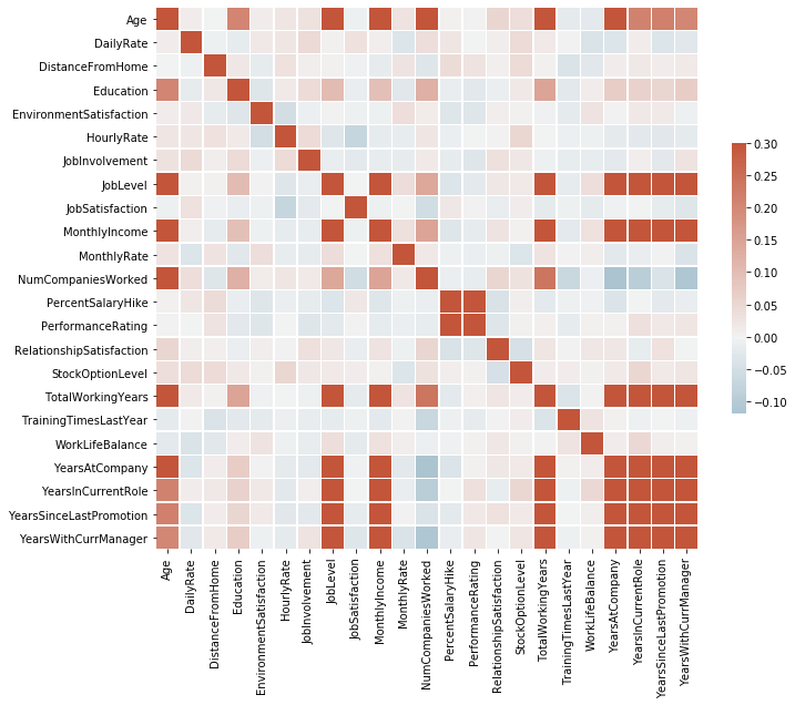
Correlation Plots
df_num = df[df.columns[df.dtypes == 'int64']][['Age', 'DailyRate', 'DistanceFromHome',\
                                              'MonthlyIncome', 'PerformanceRating', 'JobSatisfaction', \
                                             'WorkLifeBalance']]


g = sns.PairGrid(df_num)
g.map_upper(sns.histplot)
g.map_lower(sns.kdeplot, fill=True)
g.map_diag(sns.histplot, kde=True)
<seaborn.axisgrid.PairGrid at 0x7ffca5c05cd0>


<seaborn.axisgrid.PairGrid at 0x7ffca5c05cd0>


<seaborn.axisgrid.PairGrid at 0x7ffca5c05cd0>
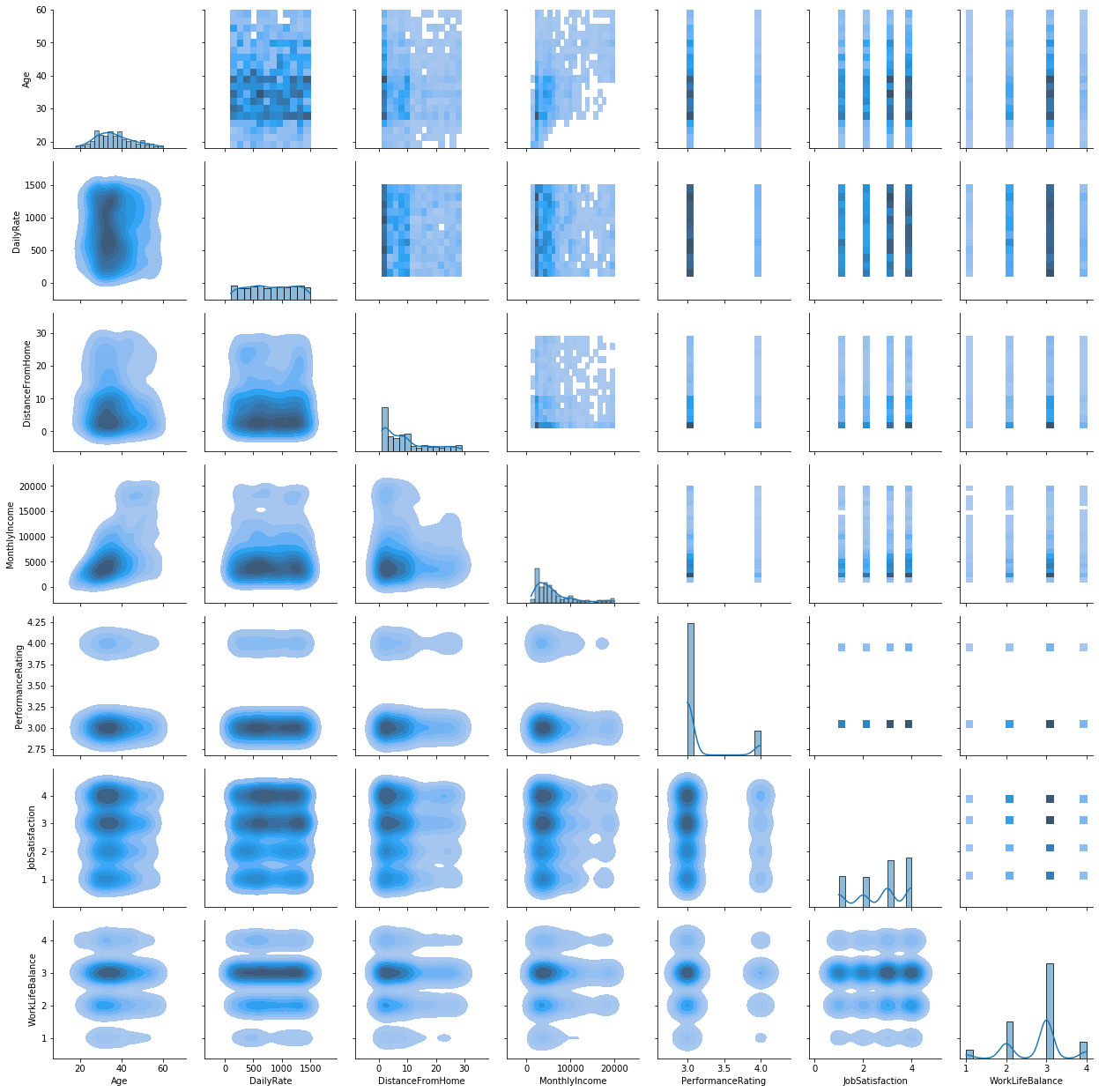
Many features are correlated although no features have a higher correlation than 0.3 or less than -0.1.
df_heat = df[df.columns[df.dtypes == 'int64']]\
    .drop(['EmployeeCount', 'EmployeeNumber', 'StandardHours'], axis=1)

corr = df_heat.corr()

# Set up the matplotlib figure
f, ax = plt.subplots(figsize=(11, 9))

# Generate a custom diverging colormap
cmap = sns.diverging_palette(230, 20, as_cmap=True)

# Draw the heatmap with the mask and correct aspect ratio
sns.heatmap(corr,  cmap=cmap, vmax=.3, center=0,
            square=True, linewidths=.5, cbar_kws={"shrink": .5})
<matplotlib.axes._subplots.AxesSubplot at 0x7ffca7201b10>
Predictive Analytics - LDA
Linear Discriminant Analysis (LDA) is a feature reduction method for data with discrete classes. It is like PCA except that it takes advantage of information about the classification in the training data. It projects data into fewer dimensions by maximizing both the mean distance between the median data point of each class and minimizing the “spread” within each class.
# Drop columns with no information
df.columns
df_clean = df.drop(['EmployeeCount', 'EmployeeNumber', 'StandardHours', 'Over18'], axis=1)
df_clean['Attrition'] = df_clean['Attrition'].apply(lambda x: 1 if x == 'Yes' else 0)
Index(['Age', 'Attrition', 'BusinessTravel', 'DailyRate', 'Department',
       'DistanceFromHome', 'Education', 'EducationField', 'EmployeeCount',
       'EmployeeNumber', 'EnvironmentSatisfaction', 'Gender', 'HourlyRate',
       'JobInvolvement', 'JobLevel', 'JobRole', 'JobSatisfaction',
       'MaritalStatus', 'MonthlyIncome', 'MonthlyRate', 'NumCompaniesWorked',
       'Over18', 'OverTime', 'PercentSalaryHike', 'PerformanceRating',
       'RelationshipSatisfaction', 'StandardHours', 'StockOptionLevel',
       'TotalWorkingYears', 'TrainingTimesLastYear', 'WorkLifeBalance',
       'YearsAtCompany', 'YearsInCurrentRole', 'YearsSinceLastPromotion',
       'YearsWithCurrManager'],
      dtype='object')
Encode Features
df_objs = df_clean.columns[df_clean.dtypes == 'object']

df_clean[df_objs]
df_enc = pd.get_dummies(df_clean, prefix = df_objs)
df_enc['Attrition'] = df_clean['Attrition'].apply(lambda x: 'Yes' if x == 1 else 'No')
df_enc.head()
| BusinessTravel | Department | EducationField | Gender | JobRole | MaritalStatus | OverTime | |
|---|---|---|---|---|---|---|---|
| 734 | Travel_Rarely | Research & Development | Life Sciences | Male | Laboratory Technician | Married | No |
| 949 | Travel_Rarely | Research & Development | Life Sciences | Male | Manufacturing Director | Single | No |
| 948 | Travel_Rarely | Research & Development | Medical | Female | Manager | Married | Yes |
| 945 | Travel_Rarely | Research & Development | Life Sciences | Female | Research Director | Married | Yes |
| 944 | Non-Travel | Research & Development | Life Sciences | Female | Laboratory Technician | Married | No |
| ... | ... | ... | ... | ... | ... | ... | ... |
| 370 | Travel_Rarely | Sales | Life Sciences | Female | Sales Representative | Single | No |
| 1036 | Travel_Frequently | Research & Development | Life Sciences | Male | Laboratory Technician | Married | Yes |
| 1033 | Travel_Frequently | Research & Development | Life Sciences | Female | Manufacturing Director | Single | No |
| 1057 | Travel_Frequently | Sales | Technical Degree | Female | Sales Executive | Single | No |
| 0 | Travel_Rarely | Sales | Life Sciences | Female | Sales Executive | Single | Yes |
1470 rows × 7 columns
| Age | Attrition | DailyRate | DistanceFromHome | Education | EnvironmentSatisfaction | HourlyRate | JobInvolvement | JobLevel | JobSatisfaction | ... | JobRole_Manufacturing Director | JobRole_Research Director | JobRole_Research Scientist | JobRole_Sales Executive | JobRole_Sales Representative | MaritalStatus_Divorced | MaritalStatus_Married | MaritalStatus_Single | OverTime_No | OverTime_Yes | |
|---|---|---|---|---|---|---|---|---|---|---|---|---|---|---|---|---|---|---|---|---|---|
| 734 | 22 | No | 217 | 8 | 1 | 2 | 94 | 1 | 1 | 1 | ... | 0 | 0 | 0 | 0 | 0 | 0 | 1 | 0 | 1 | 0 |
| 949 | 39 | No | 524 | 18 | 2 | 1 | 32 | 3 | 2 | 3 | ... | 1 | 0 | 0 | 0 | 0 | 0 | 0 | 1 | 1 | 0 |
| 948 | 30 | No | 634 | 17 | 4 | 2 | 95 | 3 | 3 | 1 | ... | 0 | 0 | 0 | 0 | 0 | 0 | 1 | 0 | 0 | 1 |
| 945 | 50 | No | 1322 | 28 | 3 | 4 | 43 | 3 | 4 | 1 | ... | 0 | 1 | 0 | 0 | 0 | 0 | 1 | 0 | 0 | 1 |
| 944 | 28 | No | 1476 | 1 | 3 | 3 | 55 | 1 | 2 | 4 | ... | 0 | 0 | 0 | 0 | 0 | 0 | 1 | 0 | 1 | 0 |
5 rows × 52 columns
Split and Normalize Data
import sklearn.preprocessing as sp
import sklearn.model_selection as skms
train, test = skms.train_test_split(df_enc, random_state=42)
trainY, testY = train.Attrition, test.Attrition
trainX, testX = train.drop(['Attrition'], axis=1), test.drop(['Attrition'], axis=1)

df_objs = df_clean.columns[df_clean.dtypes == 'object']

df_clean[df_objs]
df_enc = pd.get_dummies(df_clean, prefix = df_objs)
df_enc.head()

scaler = sp.StandardScaler().fit(trainX)
scale_train = scaler.transform(trainX)
scale_test = scaler.transform(testX)
| BusinessTravel | Department | EducationField | Gender | JobRole | MaritalStatus | OverTime | |
|---|---|---|---|---|---|---|---|
| 734 | Travel_Rarely | Research & Development | Life Sciences | Male | Laboratory Technician | Married | No |
| 949 | Travel_Rarely | Research & Development | Life Sciences | Male | Manufacturing Director | Single | No |
| 948 | Travel_Rarely | Research & Development | Medical | Female | Manager | Married | Yes |
| 945 | Travel_Rarely | Research & Development | Life Sciences | Female | Research Director | Married | Yes |
| 944 | Non-Travel | Research & Development | Life Sciences | Female | Laboratory Technician | Married | No |
| ... | ... | ... | ... | ... | ... | ... | ... |
| 370 | Travel_Rarely | Sales | Life Sciences | Female | Sales Representative | Single | No |
| 1036 | Travel_Frequently | Research & Development | Life Sciences | Male | Laboratory Technician | Married | Yes |
| 1033 | Travel_Frequently | Research & Development | Life Sciences | Female | Manufacturing Director | Single | No |
| 1057 | Travel_Frequently | Sales | Technical Degree | Female | Sales Executive | Single | No |
| 0 | Travel_Rarely | Sales | Life Sciences | Female | Sales Executive | Single | Yes |
1470 rows × 7 columns
| Age | Attrition | DailyRate | DistanceFromHome | Education | EnvironmentSatisfaction | HourlyRate | JobInvolvement | JobLevel | JobSatisfaction | ... | JobRole_Manufacturing Director | JobRole_Research Director | JobRole_Research Scientist | JobRole_Sales Executive | JobRole_Sales Representative | MaritalStatus_Divorced | MaritalStatus_Married | MaritalStatus_Single | OverTime_No | OverTime_Yes | |
|---|---|---|---|---|---|---|---|---|---|---|---|---|---|---|---|---|---|---|---|---|---|
| 734 | 22 | 0 | 217 | 8 | 1 | 2 | 94 | 1 | 1 | 1 | ... | 0 | 0 | 0 | 0 | 0 | 0 | 1 | 0 | 1 | 0 |
| 949 | 39 | 0 | 524 | 18 | 2 | 1 | 32 | 3 | 2 | 3 | ... | 1 | 0 | 0 | 0 | 0 | 0 | 0 | 1 | 1 | 0 |
| 948 | 30 | 0 | 634 | 17 | 4 | 2 | 95 | 3 | 3 | 1 | ... | 0 | 0 | 0 | 0 | 0 | 0 | 1 | 0 | 0 | 1 |
| 945 | 50 | 0 | 1322 | 28 | 3 | 4 | 43 | 3 | 4 | 1 | ... | 0 | 1 | 0 | 0 | 0 | 0 | 1 | 0 | 0 | 1 |
| 944 | 28 | 0 | 1476 | 1 | 3 | 3 | 55 | 1 | 2 | 4 | ... | 0 | 0 | 0 | 0 | 0 | 0 | 1 | 0 | 1 | 0 |
5 rows × 52 columns
Cross Validation Training
import sklearn.discriminant_analysis as sda
import sklearn.metrics as sm

from sklearn.model_selection import cross_val_score
from sklearn.model_selection import RepeatedStratifiedKFold

model = sda.LinearDiscriminantAnalysis()

# model.fit(scale_train, trainY)
# define model evaluation method
cv = RepeatedStratifiedKFold(n_splits=10, n_repeats=3, random_state=42)
# evaluate model
scores = cross_val_score(model, scale_train, trainY, scoring='accuracy', cv=cv, n_jobs=2)
# summarize result
scores

print('Mean Accuracy: %.3f (%.3f)' % (np.mean(scores), np.std(scores)))

model.fit(scale_train, trainY)

test_preds = model.predict(scale_test)
array([0.84684685, 0.87387387, 0.86363636, 0.88181818, 0.85454545,
       0.89090909, 0.89090909, 0.85454545, 0.90909091, 0.88181818,
       0.86486486, 0.87387387, 0.88181818, 0.88181818, 0.85454545,
       0.81818182, 0.89090909, 0.88181818, 0.86363636, 0.9       ,
       0.91891892, 0.87387387, 0.89090909, 0.85454545, 0.82727273,
       0.88181818, 0.84545455, 0.88181818, 0.89090909, 0.87272727])


Mean Accuracy: 0.873 (0.022)


LinearDiscriminantAnalysis(n_components=None, priors=None, shrinkage=None,
                           solver='svd', store_covariance=False, tol=0.0001)
Quick evaluation on test set
model = sda.LinearDiscriminantAnalysis()
model.fit(scale_train, trainY)

test_preds = model.predict(scale_test)
sm.confusion_matrix(test_preds, testY)
print(f'Test Accuracy: {round(sm.accuracy_score(test_preds, testY),3)*100}%')
LinearDiscriminantAnalysis(n_components=None, priors=None, shrinkage=None,
                           solver='svd', store_covariance=False, tol=0.0001)


array([[310,  30],
       [  8,  20]])


Test Accuracy: 89.7%
Extract Feature Importances
lda_features = pd.DataFrame(data={'Feature': trainX.columns, 'Contribution':model.coef_[0], 'abs_cont': np.abs(model.coef_[0])})\
    .sort_values('abs_cont', ascending = False)[['Feature', 'Contribution']]
The test accuracy is actually even higher than the cross validated training accuracy
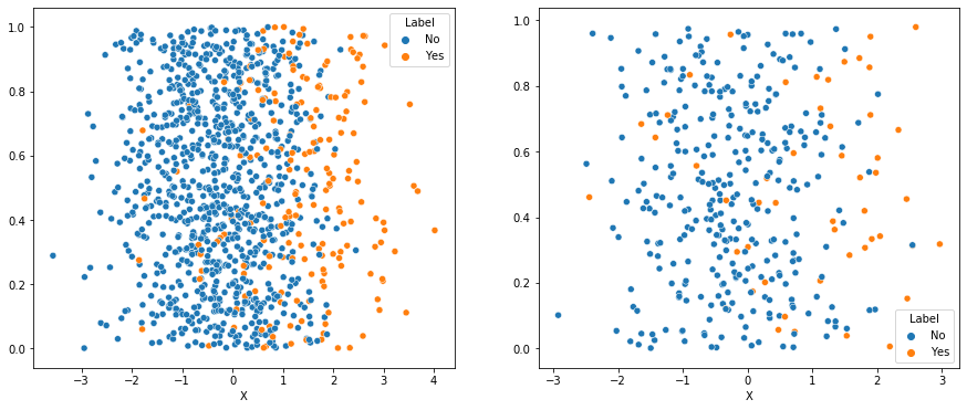
Visualize in one dimension
The accuracy is pretty high even reducing everything down to just one dimension which is pretty impressive. I show with some jitter below.
fitted_model = model.fit(scale_train, trainY)

one_d_train = fitted_model.transform(scale_train)
one_d_train = pd.DataFrame(one_d_train, columns = ['X'])
one_d_train['Label'] = trainY.values

jitter = np.random.random(one_d_train.shape[0])

fig, axs = plt.subplots(ncols=2)

fig.set_size_inches(15, 6)
# df['korisnika'].plot(ax=axs[0])
# df['osiguranika'].plot(ax=axs[1])

sns.scatterplot(data=one_d_train, x = 'X', y=jitter,  hue="Label", hue_order = ['No', 'Yes'], ax = axs[0])

one_d_test = fitted_model.transform(scale_test)
one_d_test = pd.DataFrame(one_d_test, columns = ['X'])
one_d_test['Label'] = testY.values

jitter = np.random.random(one_d_test.shape[0])

sns.scatterplot(data=one_d_test, x = 'X', y=jitter,  hue="Label", hue_order = ['No', 'Yes'], ax = axs[1])
<matplotlib.axes._subplots.AxesSubplot at 0x7ffca2b77490>


<matplotlib.axes._subplots.AxesSubplot at 0x7ffca58f45d0>
But how does this compare to XGBoost?
from xgboost import XGBClassifier
from xgboost import plot_importance

model = XGBClassifier()
model.fit(trainX, trainY)

train_xgb_preds = model.predict(trainX)
test_xgb_preds = model.predict(testX)

sm.confusion_matrix(train_xgb_preds, trainY)
print(f'Test Accuracy: {round(sm.accuracy_score(train_xgb_preds, trainY),3)*100}%')

sm.confusion_matrix(test_xgb_preds, testY)
print(f'Test Accuracy: {round(sm.accuracy_score(test_xgb_preds, testY),3)*100}%')
XGBClassifier(base_score=0.5, booster='gbtree', colsample_bylevel=1,
              colsample_bynode=1, colsample_bytree=1, gamma=0, gpu_id=-1,
              importance_type='gain', interaction_constraints='',
              learning_rate=0.300000012, max_delta_step=0, max_depth=6,
              min_child_weight=1, missing=nan, monotone_constraints='()',
              n_estimators=100, n_jobs=4, num_parallel_tree=1,
              objective='binary:logistic', random_state=0, reg_alpha=0,
              reg_lambda=1, scale_pos_weight=1, subsample=1,
              tree_method='exact', use_label_encoder=True,
              validate_parameters=1, verbosity=None)


array([[915,   0],
       [  0, 187]])


Test Accuracy: 100.0%


array([[311,  35],
       [  7,  15]])


Test Accuracy: 88.6%
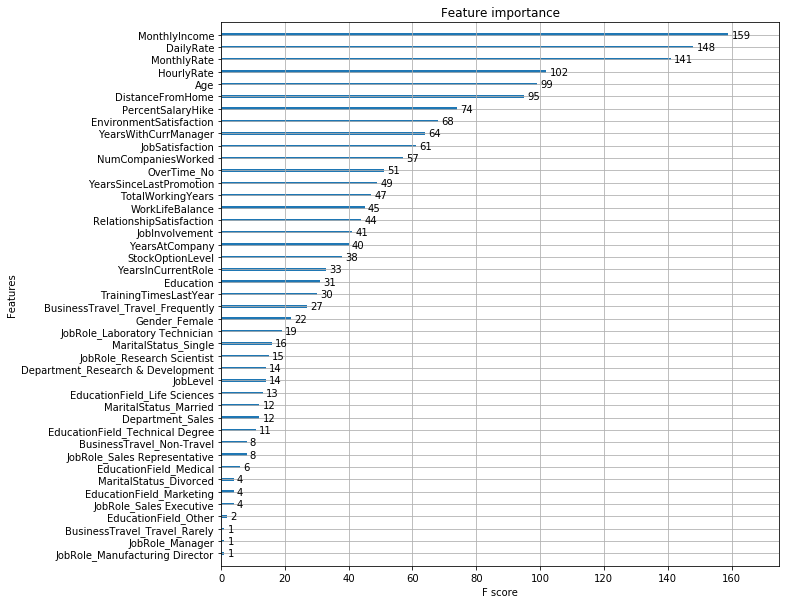
Untrained, XGBoost classifies the training data perfectly but is actually outperformed by LDA on the test data. I suspect a simple grid search would amerliorate this. First, however I want to compare the feature imporance in the two jobs.
ax = plot_importance(model)
fig = ax.figure
fig.set_size_inches(10, 10)
lda_features
| Feature | Contribution | |
|---|---|---|
| 50 | OverTime_Yes | 0.507787 |
| 49 | OverTime_No | -0.507787 |
| 4 | EnvironmentSatisfaction | -0.491681 |
| 45 | JobRole_Sales Representative | 0.489383 |
| 11 | NumCompaniesWorked | 0.487821 |
| 8 | JobSatisfaction | -0.445302 |
| 6 | JobInvolvement | -0.417925 |
| 21 | YearsSinceLastPromotion | 0.389570 |
| 16 | TotalWorkingYears | -0.380487 |
| 22 | YearsWithCurrManager | -0.299832 |
| 48 | MaritalStatus_Single | 0.295092 |
| 18 | WorkLifeBalance | -0.284870 |
| 2 | DistanceFromHome | 0.262430 |
| 0 | Age | -0.254437 |
| 14 | RelationshipSatisfaction | -0.252732 |
| 20 | YearsInCurrentRole | -0.251739 |
| 41 | JobRole_Manufacturing Director | -0.241343 |
| 24 | BusinessTravel_Travel_Frequently | 0.238570 |
| 23 | BusinessTravel_Non-Travel | -0.219165 |
| 37 | JobRole_Healthcare Representative | -0.215543 |
| 15 | StockOptionLevel | -0.199956 |
| 43 | JobRole_Research Scientist | -0.195798 |
| 19 | YearsAtCompany | 0.193145 |
| 17 | TrainingTimesLastYear | -0.191518 |
| 39 | JobRole_Laboratory Technician | 0.184980 |
| 42 | JobRole_Research Director | -0.179125 |
| 38 | JobRole_Human Resources | 0.176008 |
| 47 | MaritalStatus_Married | -0.157675 |
| 29 | EducationField_Human Resources | 0.153075 |
| 27 | Department_Research & Development | 0.144829 |
| 34 | EducationField_Technical Degree | 0.144608 |
| 26 | Department_Human Resources | -0.139333 |
| 46 | MaritalStatus_Divorced | -0.137834 |
| 9 | MonthlyIncome | 0.136029 |
| 7 | JobLevel | -0.122578 |
| 36 | Gender_Male | 0.105500 |
| 35 | Gender_Female | -0.105500 |
| 44 | JobRole_Sales Executive | 0.094384 |
| 1 | DailyRate | -0.091678 |
| 33 | EducationField_Other | -0.090564 |
| 28 | Department_Sales | -0.089418 |
| 12 | PercentSalaryHike | -0.086685 |
| 32 | EducationField_Medical | -0.086016 |
| 13 | PerformanceRating | 0.065262 |
| 25 | BusinessTravel_Travel_Rarely | -0.056734 |
| 5 | HourlyRate | -0.051925 |
| 31 | EducationField_Marketing | 0.049313 |
| 30 | EducationField_Life Sciences | -0.031653 |
| 40 | JobRole_Manager | -0.028730 |
| 3 | Education | -0.025777 |
| 10 | MonthlyRate | 0.009458 |
Interestingly LDA shows the monthly and hourly rates having some of the lowest feature importance while XGBoost has them among the highest.
Marshall Krassenstein
Solutions Architect
Solutions Architect at Databricks. Likes pickleball, staying active and smoothies